Understanding the Two Cover Personalisation Positions
When customising the front cover of your album, you have two options for personalisation placement: optical centre or title position. Each option offers a distinct aesthetic and appeal, and choosing between them depends on the look you wish to achieve for your album.
Optical Centre
The optical centre is a spot just above the physical centre of the cover, typically about 10% higher, and is the most popular option. This position is accepted as a natural place to balance the cover because placing objects in the exact physical centre can sometimes appear slightly too low. It’s one of those subtle optical illusions that makes the optical centre a visually pleasing choice.
- Pros: The optical centre is a classic choice that creates a balanced and elegant look. It is particularly well-suited for traditional albums or for those seeking a timeless design.
- Cons: It may not have the contemporary appeal that some clients look for, especially if they want a more modern or dynamic layout.
Title Position
The title position is located about one-third from the top edge of the cover. This means it is placed higher up compared to the optical centre, giving a more elevated appearance.
- Pros: The title position is often considered a more modern and contemporary option. It creates a sophisticated look that works especially well for A4 portrait orientation fine art albums, making it a popular choice for these formats.
- Cons: The elevated placement may not suit those looking for a traditional or symmetrical design. It can sometimes make the album feel less centred and balanced, depending on the overall aesthetic of the cover.
Choosing the Right Position for Your Album
- Optical Centre: Choose this option if you prefer a classic, balanced look that is timeless and elegant.
- Title Position: Opt for this if you are aiming for a modern, sophisticated style and especially if your album is in A4 portrait orientation. This position helps the cover text stand out in a contemporary way.
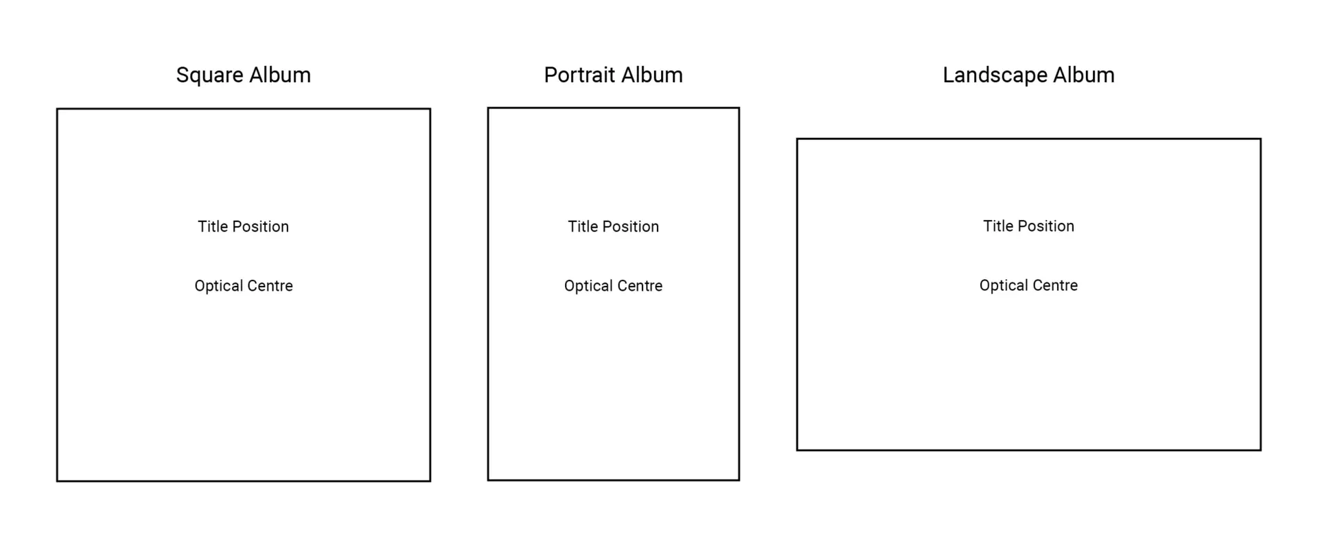
Visual Representation of Position Options
Below is an illustration showing the difference between the optical centre and title position on different album formats (square, portrait, and landscape):

Need Help Deciding?
If you’re still unsure which position to choose for your album, feel free to reach out to us. We’re happy to provide recommendations based on your specific album style and preferences to help you achieve the perfect look!


